Forecasting
Introduction
Appointment volumes have been increasing in SNEE. In order to estimate future appointments demand in the SNEE footprint, the project aims to leverage historical appointments data, analyze key patterns and trends, and develop a predictive/machine learning model to forecast the number of GP appointments at a regional level within the NHS framework. The project is focused on providing data-driven insights that can assist healthcare providers in better resource allocation, planning, and operational management. As patient numbers fluctuate due to various factors, predicting the number of future appointments can help mitigate overbooking or underutilization of healthcare services. The ultimate goal is to create a reliable and efficient predictive model that accounts for historical data and other relevant factors.
Data source
The primary data used for this analysis is derived from the extensive dataset provided by NHS England.
| Dataset | Description | Website URL | Download Zip |
|---|---|---|---|
| NHS GP Appointments by Region | This dataset spans from Nov 2021 to Apr 2024, providing current GP appointment data at a SUB-ICB level, including details on healthcare professional types, appointment counts, and months. | NHS GP Appointments by Region | Download |
| NHS GP Appointments Historical Data | This historical dataset covers Oct 2019 to Mar 2022, allowing analysis of GP appointments trends, with details on healthcare professional types and appointment counts. | NHS GP Appointments Historical Data | Download |
| Population Projections for CCGs by ONS | Used for forward-looking appointment estimates in the model, based on 2018 projections revised in 2020. Data is at the CCG (now SUB-ICB) level. | ONS Population Projections | N/A |
Methodology
The predictive approach leverages machine learning techniques implemented through Scikit-learn, with particular focus on preprocessing large datasets, feature selection, and model evaluation using various metrics such as Mean Squared Error (MSE) and Root Mean Squared Error (RMSE).
Data Loading and Preprocessing:
- Data from NHS GP appointments is loaded using pandas. Key variables such as appointment date, region, and healthcare provider type are selected for analysis.
- Focus is placed on working-age individuals (20-65) and those over 65.
- Average appointments per person per working day was calculated using the data sources, which was also our Target variable for Machine learning models
Exploratory Data Analysis (EDA):
- Trends and patterns are explored using time series visualizations from matplotlib.
- Autocorrelation (ACF) and partial autocorrelation (PACF) analysis using statsmodels helps identify time dependencies.
Modeling:
- Various regression models, including Linear Regression, Lasso, and Ridge, are employed. A Pipeline from sklearn is used to streamline preprocessing and modeling steps.
- Hyperparameter tuning is performed using GridSearchCV to identify the best model configuration.
- Dimensionality reduction with Principal Component Analysis (PCA) improves model performance.
- Cyclic Nature of Time (Months): To account for the cyclic nature of months (where January is close to December), the APPOINTMENT_MONTH column is transformed using sine and cosine functions. This maintains the cyclic pattern of time and allows the model to better capture seasonal effects. Sin transformation: sin(2π×month/12) Cos transformation: cos(2π×month/12)
- Models are evaluated using Mean Squared Error (MSE), Mean Absolute Error (MAE), and Root Mean Squared Error (RMSE).
Forecasting:
- The model with best RMSE score is selected and used to fit on complete dataset.
- The final model generates appointment predictions, which are visualized to highlight potential trends.
Model Saving:
- The model is saved with joblib for future use without retraining.
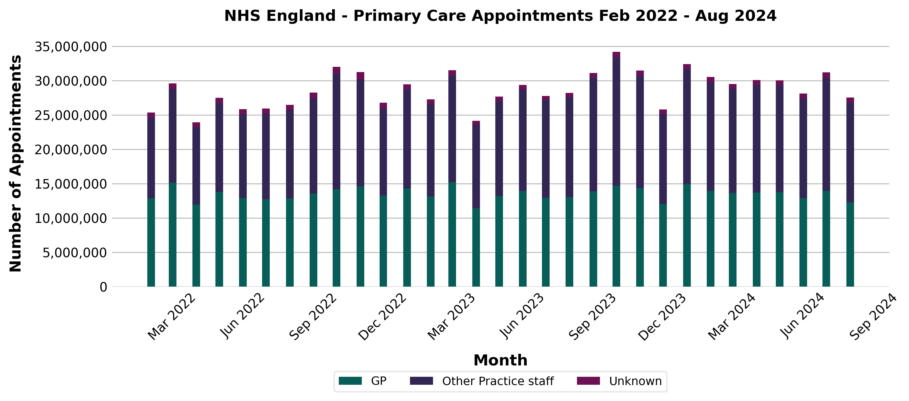
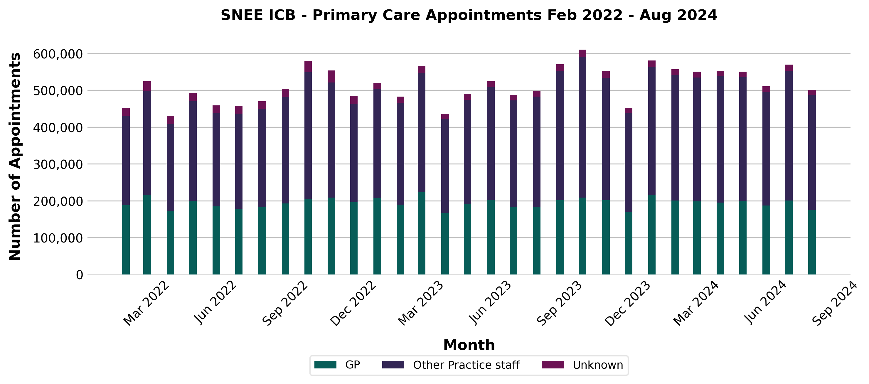
Primary care Appointments in England and SNEE-ICB
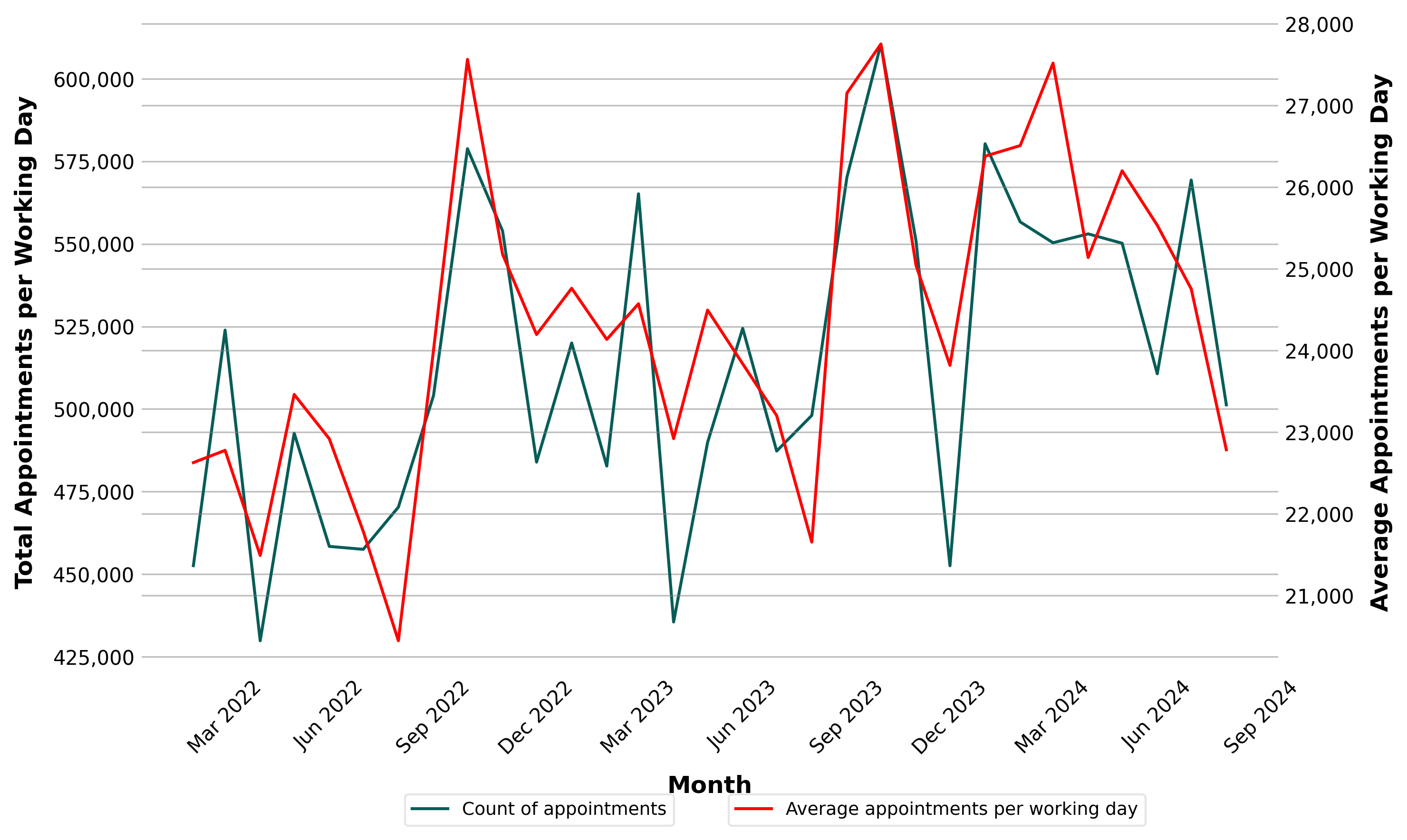
Trend plot for Primary care Appointments/working-day in SNEE-ICB
Statistical Forecast
There is a clear 12-month observed where the number of appointments peaks around october each year. When correcting for the number of working days in a year, this observed seasonality becomes stronger.
Machine learning Model Evaluation
| Model | Best Params | RMSE | MAE |
|---|---|---|---|
| Linear Regression | {'model__copy_X': True, 'model__fit_intercept': True, 'model__n_jobs': None, 'preprocessor__pca__n_components': 4} | 0.002683 | 0.002065 |
| Lasso | {'model__alpha': 0.01, 'model__fit_intercept': True, 'model__max_iter': 1000, 'preprocessor__pca__n_components': 1} | 0.003091 | 0.002443 |
| Ridge | {'model__alpha': 0.1, 'model__fit_intercept': True, 'model__solver': 'auto', 'preprocessor__pca__n_components': 4} | 0.002672 | 0.002064 |
- The best model based on RMSE value is Ridge Regression model (Pickle file for Ridge regression model)
Ridge Regression Models Outputs
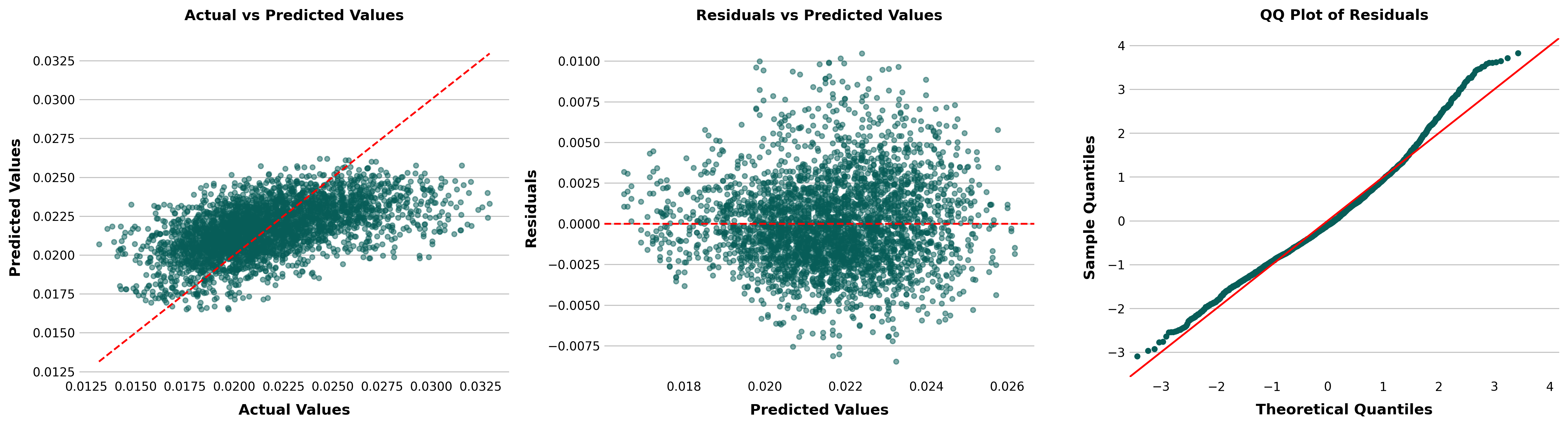
Actual vs. Predicted Values (Left Plot):
- This plot compares the actual target values to the values predicted by the model.
- The red dashed line represents the ideal scenario where the predicted values exactly match the actual values (i.e., perfect predictions).
- In this case, the points cluster around the line, but there is some spread, indicating that while the model does a decent job predicting, there are noticeable deviations.
- If the spread is consistent across the range, the model may perform well overall but with some errors.
Residuals vs. Predicted Values (Middle Plot):
- This plot shows the residuals (the differences between actual and predicted values) against the predicted values.
- The red dashed line at 0 represents where residuals should lie if the model predictions were perfect.
- Ideally, residuals should be randomly scattered around the line, with no discernible pattern. This randomness suggests that the model captures the true relationship well.
- Here, the residuals seem relatively scattered, though there might be some slight variance at different predicted values. This could indicate heteroscedasticity (non-constant variance), meaning that the model's errors might differ across different ranges of predicted values.
QQ Plot of Residuals (Right Plot):
- The QQ plot compares the distribution of the residuals to a normal distribution.
- If the residuals are normally distributed, they should lie along the red diagonal line.
- In this case, most points lie along the line, indicating that the residuals are approximately normally distributed. However, there are deviations at the extremes (particularly on the right), suggesting that there might be outliers or that the residuals are slightly skewed.
Conclusion
Overall: The model seems to perform reasonably well but not perfectly. The residuals are generally well-distributed, though there may be slight issues with heteroscedasticity and some outliers or non-normality in the residuals. The model’s predictions are close but not exact, and there may be some room for improvement in how it handles extreme values or certain ranges of the data.